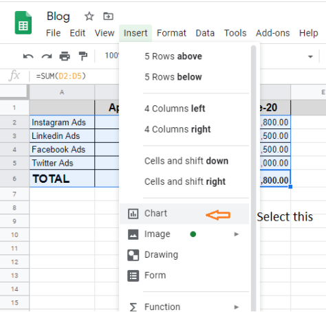
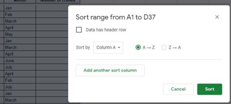
Many of you won’t believe me when I say this, but most of us have probably been using a bunch of Google Sheets and Excel formulas in our day-to-day life. Shopping for clothes and accessories on your favorite e-commerce site? You probably apply Filtering to look for a particular item of clothing and then go through the drop-down for a specific price range. We rely on Sorting while shopping at a supermarket, comparing the price of gluten-free biscuits with organic kale chips (high to higher). These formulas are nothing but mental shortcuts that allow us to arrive at conclusions and make decisions faster.
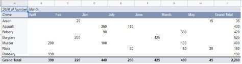
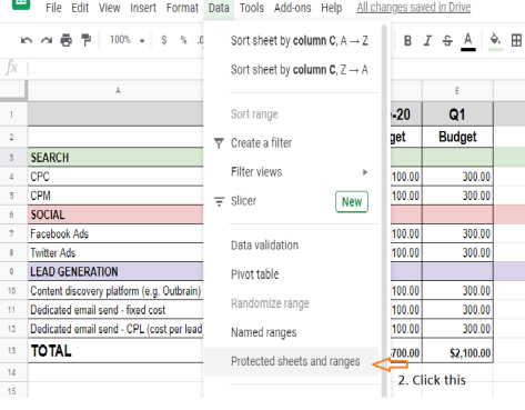
Here’s a fun exercise for my readers: Come up with some real-life situations or examples of where you see yourself using Google Sheets formulas or tools for pivot tables, graphs, summation, frequency counting, and protecting your cells and sheets?

Demystifying VLOOKUP
When working with a lot of data, one of the challenges is finding information across multiple tables and combining them in your output. VLOOKUP is a very powerful formula that allows you to cross-reference value from one column against a search key in another column. Let me demonstrate this with an example. When you log on to a travel portal to book flights online, you will want to check the departure and arrival time of your preferred flight. There’s a lot of complex and multi-layered VLOOKUP queries being run in the background so you get the list of flights in the Arrival and Departure columns. That’s the magic of this formula!

How VLOOKUP Works
Let me highlight another example where you can apply the logic of VLOOKUP in real life. Say you visit a restaurant and browse through a big menu. The table of contents is a group of items (Appetizer, Starter, Main Course, Dessert, Beverages) with page numbers alongside. You will need to go to the individual sections to further look for items within each course and check the price of each item. Basically, you are cross-referencing the individual items to the broad categories in the table of contents. If this were a menu on Google Sheets, you would use VLOOKUP to cross-reference value from Column 1 (Table of Content in one table) against Column 2 (menu items in another table).
A lot of people think that VLOOKUP is a very complex function but it’s not that hard once you understand the basics of what you need to do. VLOOKUP function can be performed across a single sheet, multiple tabs in a sheet or multiple sheets as well.

Using VLOOKUP
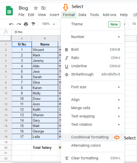
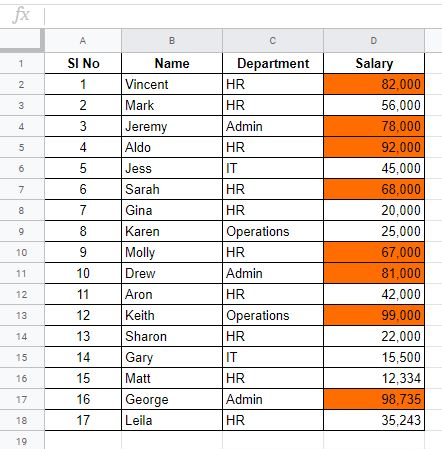
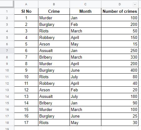
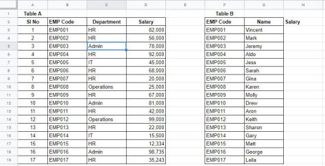
In the screenshot below, you will see two tables: Table A and Table B.
- Table A contains the employee code, department, and salary.
- Table B contains only employee code and employee name.
Now I want to see the salary for each employee in a new column, column H. Sure, you could think why don’t we just copy-paste this data? For a simple table like this, copy-paste would be easy. However, if the data were in different tabs or another Google Sheets, or the table had thousands of rows, you wouldn’t want to spend time copy-pasting!
This is where we get VLOOKUP to work for us.
Usage
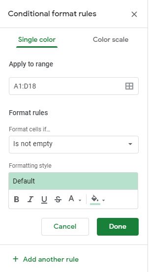
Formula: VLOOKUP(search_key, range, index, [is_sorted]
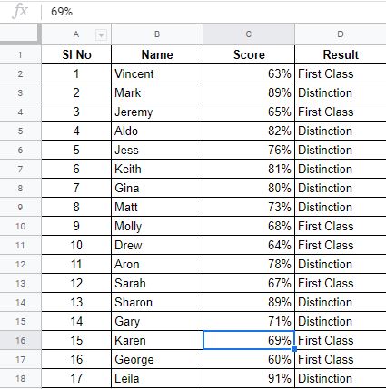
Let’s try the formula in cell H3 for getting salary details for EMP001 (Vincent). In the screenshot below, I have highlighted the formula.
H3 = VLOOKUP($F3,$B$2:$D$19,3,FALSE)
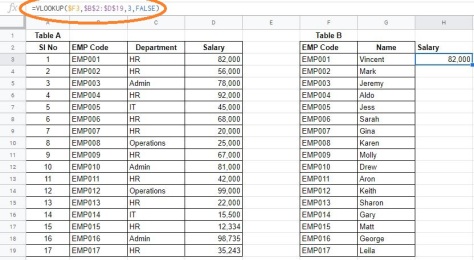
Let’s break down this formula H3 = VLOOKUP($F3,$B$2:$D$19,3,FALSE)
- F3 is EMP001 in Table A.
- B2 to D19 is the table range where salary is present for each employee
- 3 is the index number, in this case, Salary (column D) is column no 3
- FALSE – We want the exact match
search_key: The search key is the main thing you want to search in a table. In this case, the search key will be the employee code since that’s the common thing in both the tables
range: This is the range where we want to search. In this case, we will take Table A and columns B, C, and D. The reason we want to start from column B is that the employee code starts from that column
index: This is the column number where the output is given. In this case, the salary is in column D. But since we started the table from column B the index # becomes 3. Think of it this way B = 1, C=2, D=3.
index numbering: The index numbering will always start from where you select the table. If we had selected the table from column A then the index # would have been 4. Here is how: A=1, B=2, C=3, D=4.
is_sorted: You have two options – true or false. FALSE means you want to find an exact match. TRUE will give you an approximate match.
Notice that we have got dollar signs ($) against some of the values. $ locks the cell or the range in place. This is pretty useful if you want to copy the same formula across different cells. In our case, in the first value of the formula ($F3), we have locked only the column F but not the row.
In the case of the range ($B$2:$D$19), we have locked the start and the endpoint of the range. This is important otherwise the range will keep on shifting automatically when the formula is copied to a different cell.
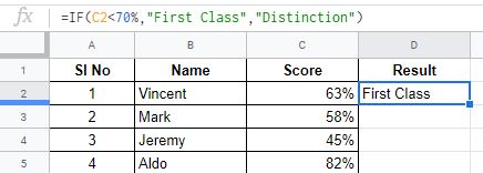
If this is still looking too complex, look at the screenshot below.

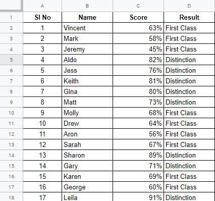
Now copy (drag) the formula to the other cells in column H. You should get the result as shown in the screenshot below.

Things to remember when doing VLOOKUP
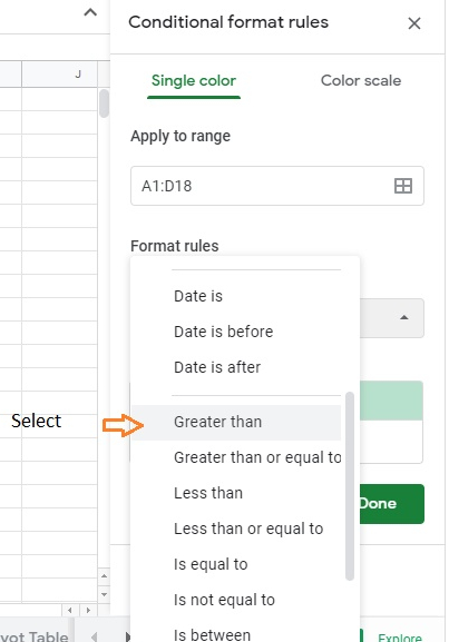
- Google Sheets VLOOKUP cannot look at its left, it always searches in the first (leftmost) column of the range.
- VLOOKUP in Google Sheets is case-insensitive, meaning it does not distinguish lowercase and uppercase characters.
- When is_sorted is set to TRUE or omitted (VLOOKUP with the closest match), remember to sort the first column of range in ascending order.
- If there are multiple matches VLOOKUP will match with the first instance that it finds in the table
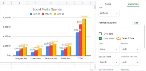
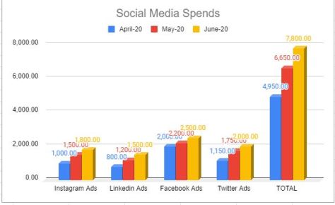
I hope it has been easy to understand how VLOOKUP and other Google Sheets formulas can be used in different situations and contexts based on the examples I shared. Don’t let formulas scare you off data and don’t let data turn you off from mastering spreadsheets. Formulas are just shortcuts to help you manipulate data, but they are secondary. The primary goal of mastering a spreadsheet is to convey something meaningful with your data. There’s beauty in that!